It started with a gimmicky Facebook appeal: which cover design did my Facebook friends prefer? They voted and there was a clear favourite:

But there was also a strong suggestion that the photo I’d picked for the cover – something from my own collection – was clichéd. The design purists suggested an all-typographical cover. But, those with book-selling experience cautioned that books with pictures on the cover tend to attract more attention. The reply that really caught my attention, though, was one from my artist buddy at the Straits Times, Dengcoy Miel. For some reason he couldn’t see the shortlisted cover design on his computer. I saw my opportunity…

Dengcoy and I have collaborated on various projects inside and outside the Straits Times. I wrote the text for his little book of Singatoons, for example. For me, at least, it was a thrill to work together again (although “work” is probably the wrong verb; it usually feels like play). I gave him a quick synopsis and before long he offered some sketches…

To me, the first one was the most promising. I made a few minor suggestions: “Would it be possible to have the finger reaching for the ESC key? I realise it may be hard to make the key visible. But the reason why this would be a good touch is that it would represent clearly the government’s power to ‘reboot’ the press any time it likes. If the heads represent the press, then can you make half of them women and most of them younger than us? Would it be possible to make it more obvious that they are reporters, by having a few of them hold out mics, a couple hold cameras? Let’s show them at work, rather than looking like robots, because a key point in my book is that journalists try to be professional even if the government has its finger on the ‘esc’ key.”
My other suggestions: “For visual/dramatic interest, I wonder if you should also draw in one small frightened reporter peeking out from behind the screen on the left side, watching at the hand. The politician: most don’t wear suits so he could have a long sleeved white shirt if you like. But I guess suits symbolise power better that shirts do. So I leave that up to you.”
And knowing that I wasn’t going to be able to pay him his worth (if at all) I suggested that he include a self-portrait – a cartoonist with a sketch pad amidst the other journalists.
Since the time we were colleagues in Times House, Miel has gone up in the world. So his moonlighting on this project was interrupted by a trip to Paris to exhibit his works and give talks. Today, at last, his final masterpiece arrived:

Here’s how it could look on the cover:

That’s another step closer to publication. Thanks, Miel!
UPDATE
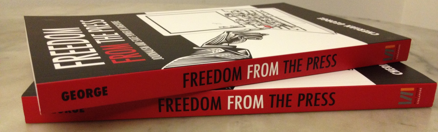
Miel liked the idea of black bands on the cover: “It looks a lot more solid and stable,” he said. The designer at NUS Press gave it the final touch: a blood red back and spine. Here’s what’s going to press:

Be the first to comment on "The cover story, continued"