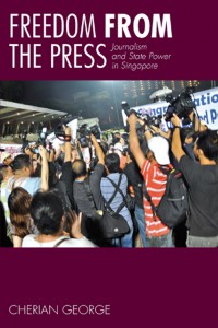
I’m glad I reached out to my Facebook friends for feedback on my proposed covers. The original design was this:
 I was emotionally attached to the photo – mainly because I shot it myself. But I’m old enough to know that ego is not the best guide to making creative choices. So although my publisher was happy with the mock-up, I decided I’d better consult others.
I turned to my friend, Tay Kay Chin, who recently collaborated with me on the GE11 photo magazine project and whose design sensibilities I trust. He confirmed my fears, commenting that “the picture of media photographers has become a cliché to illustrate press-related issues”.
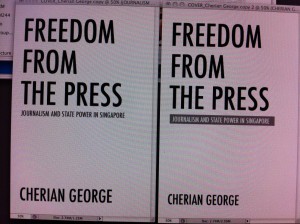
 He approved of my choice of Futura for the typeface, though (“tall and classy”, he said) and suggested a typography-only cover. The title was strong enough to sell the book, he said. Kay Chin quickly MMSed a photo of a couple of options (right).
That’s when I decided to do a poll. In addition to my original design and Kay Chin’s typography-only cover, I did a hybrid version, with larger type and a smaller image.
 Option C (left) turned out to be the crowd favourite, garnering 44 percent of the 115 votes cast, including from cartoonist Otto Fong. Around 23 percent, including Ivan “Rambling Librarian” Chew, liked my original cover for the photo and strong colour. Around 27 percent went for Kay Chin’s type-only version.
So, should I go with the popular vote and pick Option C? KC Chew, who ran his own publication design house before becoming Singapore’s most successful university fund-raiser, warned me not to be governed by a poll. The respondents are not expert cover designers nor marketeers, he pointed out. “Let the poll results guide you but you can still make a non-bandwagon choice regardless!” he said.
One thing that the feedback forces me to admit is that my photo will have to go. “The title is great but the photo doesn’t quite do it justice,” said fellow academic Lim Sun Sun. The New Paper’s design chief (and the ST group’s Journalist of the Year 2010) Hup Lee didn’t like the covers with the photos either: “A and C is some thing I would expect to see if Tom, Dick and Harry were to write the same book. My take: B. It’s classy, clean with a tinge of seriousness. No photo needed.”
But, would an all-typography cover be too austere? Well, one option is to add a graphic illustration. One of Singapore’s most respected newspaper artists has promised to send me some sketches. Watch this space!

Be the first to comment on "To the drawing board"